Colour is one of the most powerful forms of non-verbal communications. There is great diversity in the use of colours and their associations between cultures, and even within the same culture in different time periods. The same colour may have very different associations within the same culture at any time. For example, red is often used for stop signs or danger. At the same time, red is also frequently used in association with rituals in India, e.g. During Indian weddings.
For every retailer, selling is the art of persuasion. Colour plays a pivotal role in the customer’s critical decision — to buy or not buy. Before selling something, first it is important that it makes sense to you, because colour is a grave detail of anything that you present. There are a lot of different factors that influence how and what consumers buy. A large part of every decision is based on its visual elements, and one of the strongest and most persuasive is colour.
Since colour is an important factor in the visual appearance of products as well as in brand recognition, colour psychology has become important to marketing. Colour offers a quick method for conveying meaning and messages in logo design. Recent work in marketing has shown that colour can be used to communicate brand personality. It is an obligation for designers to use colours appropriately, relate it to the product/service of the brand and understand the meaning behind the colours they choose. A designer needs to pick the colours carefully to enhance specific elements of the logo and bring nuance to the message with the use of shade and tone.
The physiological and emotional effect of colour in each person is influenced by several factors such as past experiences, culture, religion, natural environment, gender, race, and nationality. When making colour decisions, it is important to determine the target audience in order to convey the right message. Colour decisions can influence both direct messages and secondary brand values and attributes in any communication. Colour should be carefully selected to align with the key message and emotions being conveyed in a piece. If your client is a global corporation, choose your logo colour with care. There are cultural differences in the way colours are interpreted. For example, red is considered lucky in China, while white is the colour of death and mourning in India. There’s a good round up of the cultural connotations of different colours
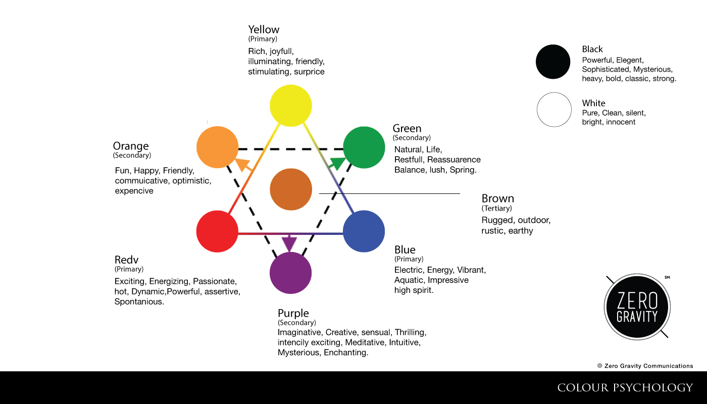
Every colour, including black and white, has implications for logo designing general terms; bright and bold colours are attention-grabbing but can appear brash. Muted tones convey a more sophisticated image, but run the risk of being overlooked. More specifically, particular meanings are ascribed to different colours in society.
Here are few of the many logos our team has created; the colours selected for each logo are meaningful, relevant to the brand and apt for its products/services.
The Blue Oven
About the brand : All the grumps fade away when pizzas pop up! Browsing through the history of the flat bread pizza, we come across Marinara, one of the “pure” and older forms of pizza which was traditionally prepared by seaman’s wife to cure her sea-suffering husband returning from the Bay of Naples. This place inspired one of our clients to set up a pizzeria containing a true essence of pizza. This explains the name The Blue Oven. The pizzeria provides options to its customers to select from the toppings, allowing the customers to choose their own flavor. The uncommon component lies in the blue oven used which shares a resemblance to the ones found in Italy. An element of the same is beheld in the logo.
About the logo : The logo shows the archetypal ovens that are found in Italy. There is a play on the colours blue and orange mainly. The logo is kept simple and explicitly directed towards the concept of the pizza café.
The colour blue is used more in order to highlight and clearly put forth the idea.
Brown has masculine connotations and is often used for products associated with rural life and the outdoors.
Red/Orange — It has also been found to stimulate appetite, which explains why it is used in so many restaurants and food product logos. Choosing red for your logo can make it feel more dynamic.
Respire
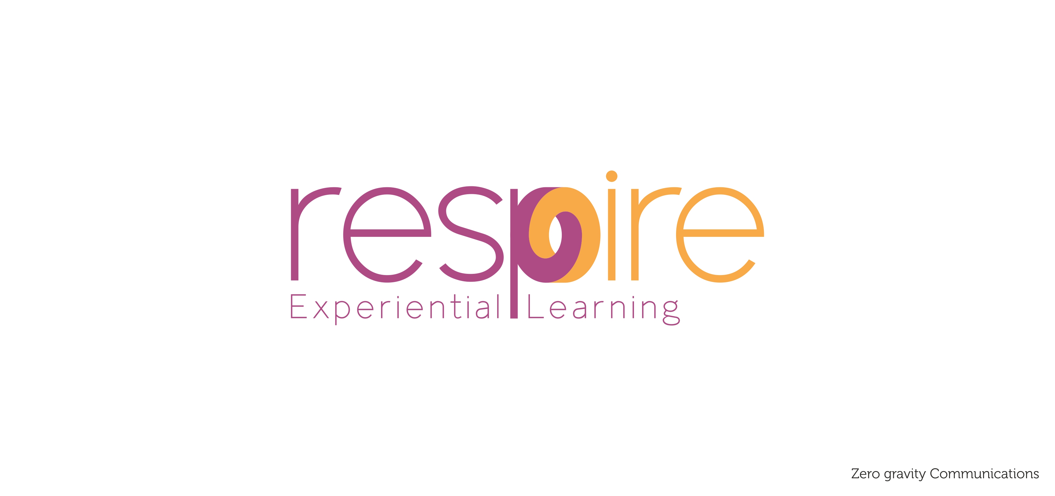
About the brand : Respire is focused to make foundation level education more application and experience based. They focus on methods like Do It Yourself and Hands on learning, which are most optimum methods for experiential learning.
About the logo : Purple speaks to us of creativity, imagination and wisdom. It has long been associated with implying dignity, and throughout history it has been the colour of wealth and riches.
Orange is often seen as the colour of innovation and modern thinking. It also carries connotations of youth, fun, affordability and approachability. Also orange is friendly, cheerful and a colour that depicts confidence.
Zero Gravity Communications

About the brand : We are “an idea” driven advertising, branding and marketing consulting agency. Changing the conventional belief and stagnant positioning of a brand is the challenge that we work around. Distinctive, simple and minimal positioning is key of our own positioning .
About the logo :
Black: Black is the colour of authority and power, stability and strength. It is also the colour associated with intelligence (doctorate in black robe)
White: White has a modern appeal. For most of the world this is the colour associated with purity (wedding dresses); cleanliness (doctors in white coats) and the safety of bright light. White is also associated with creativity (white boards, blank slates). It is a compression of all the colours in the colour spectrum.


