#instagram #rebranding
Disclaimer : Visualisation is very personal and perspective driven.
When a brand’s visual representation form, in other words, the logo, that has been in the market for quite a long period of time, it is difficult for not only for the consumers to adapt to this change, but also proves to be wearisome for decision makers to begin with.
On the contrary, very frequently we see younger brands especially, startups are changing their #branding strategies at a short sprint with a very radical thought.
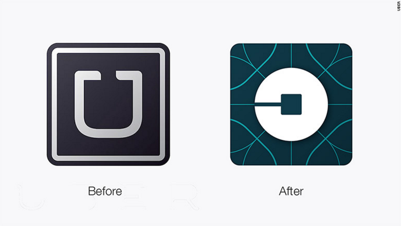
Recently, we witnessed UBER with a drastic change of their logo; Bringing in more country specific flavours and variation. The previous logo was much relatable and engaging. The target audience somehow felt that the change in this identifiable representation was totally uncalled for and thus, it was criticised. But facts have confirmed that we, human beings are resistant to change. Nevertheless, after initial rejection and denial, we have grown into using this new identity seamlessly, forgetting the inaugural disapproval.
#startups, usually when they are launched, the emphasis is not laid upon placing their branding on a greater platform or presenting the logo as an iconic symbol; but it is about putting forth their idea in the light of success. As the idea takes shape of successful operations and consumer acquisition, the priority again shifts back to the basics and mostly uses rebranding exercise to reaffirm their positioning, whilst gaining the much needed traction.
Usually, branding strategy is integrated with a lot many other goals and objectives; to name a few of these:
- Showing the evolution of a company ,
- Introducing new segments, regions, brands , etc
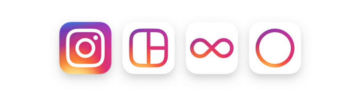
- Integrating different parts into one uniform identity : In this case you’ll also see updated icons for our other creative apps: Layout, Boomerang and Hyperlapse besides Instagram.
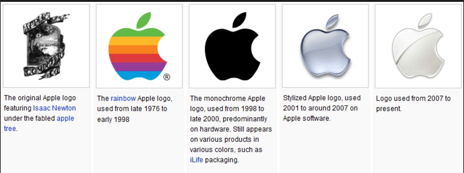
The ideal evolution of the Apple logo, is the catalyst and an impulse for us and many other designers. The logo which had started off with a multi-coloured sketch has transitioned into a much simpler and sophisticated design with a minimalistic approach over the years.
And for Instagram:
For Instagram what we like :
- what we like is that it falls under the trend of “less is more”, in the sense that it is minimalistic and easily approachable.
- It is easy and flexible and that is the future of design. People in general might find it hard to accept because it is such a bold step. Had they done it in phases, it might have been easier to accept for the masses.
- Gradient is and has always been less of preference and it limits the visibility and recall of the logo to non-digital formats.
- We can’t relate to their logo explanation of “inspired by community connection” but that is plausible.
Happy Posting on Evolved Instagram ! :)


